 When i first started researching i cut out some articals to analyse them and see what was typically in a newspaper, the newspaper i used was a local one so this gave me a good idea of that type of articals would look good in my own newpaper.
Below i looked at some very sucsessful newspapers to get an idea of the layout.

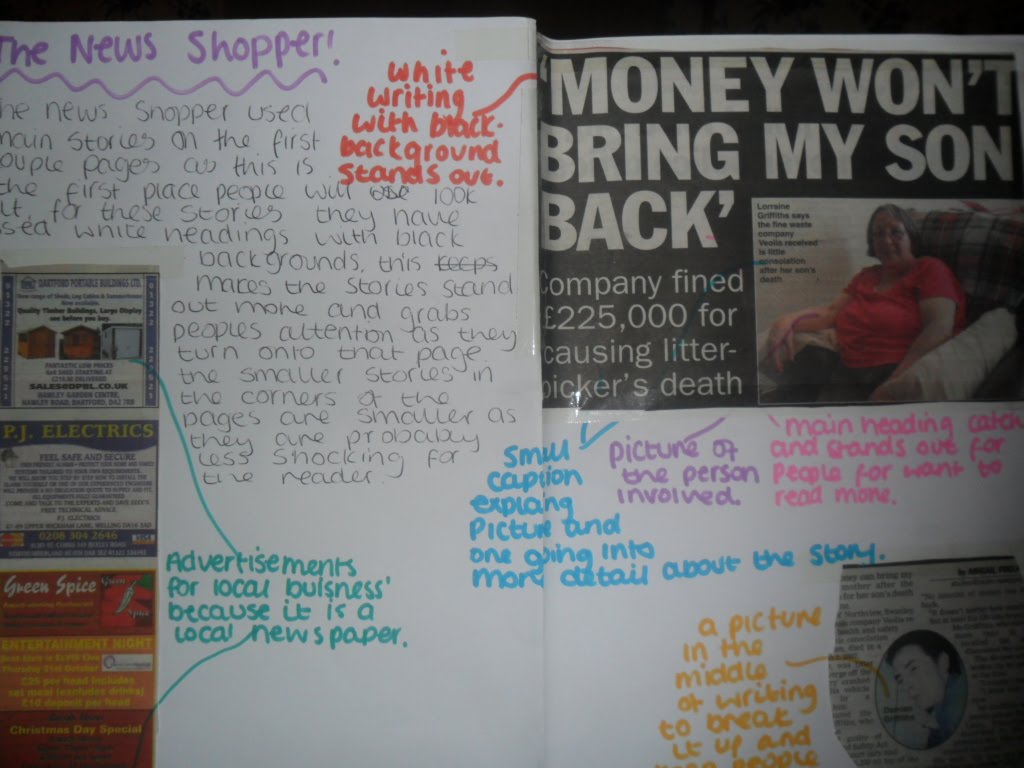
- The main heading is in the corner so you can recognise straight away what newspaper it is.
- Main image, relevent to story and eye catching.
- smaller picture, breakes up writing and keeps people interested.
- white writing on black background stands out and big bold writing.
- Smaller story in the corner.

- The newspaper heading in big bold letters so that you know what the newspaper is straight away.
- Main story heading top of the page and bold writing.
- Big picture in the middle as main focus of the front page.
- Main story split into two sections, this will keep the readers more interested
No comments:
Post a Comment